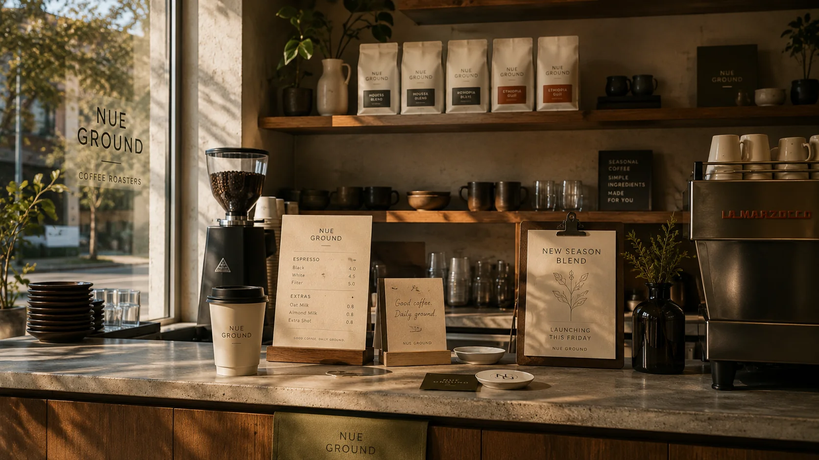
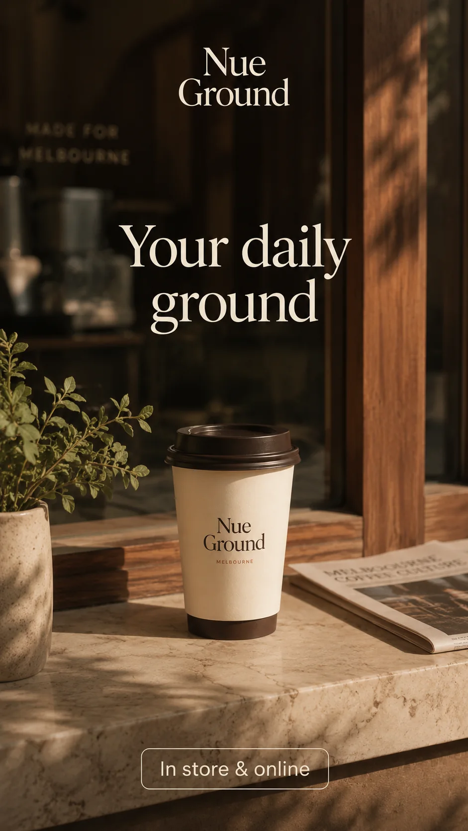
Counter, window and shelf moments feel like one Melbourne cafe environment.
Back to work
Nue Ground / Cafe brand identity / Social launch
A cafe identity for seasonal daily rituals.
A local coffee brand system designed to move from wordmark and packaging into cups, menus, social launch content and storefront communication.
RoleVisual Designer
Timeline2 weeks
CategoryBrand Identity / Packaging / Social Launch
What this provesA local cafe can look refined without losing practical counter clarity.
Best forCafes, dessert shops and small food or retail brands.
Business valueCups, menu, packaging and launch posts feel like one brand world.
Next stepStart a Brand Brief
Brief
A warm cafe identity without generic coffee symbols.
The brief was to create a commercially believable Melbourne cafe identity that can work across coffee packaging, takeaway cups, espresso menus, window signage and social launch content.
- Objective
- Build an identity that feels believable before the customer reaches the counter.
- Design response
- Replace cafe cliches with typography, warm materials, clear product hierarchy and everyday rituals.
- Proof of system
- The visual language holds across cup, bag, menu, receipt, window and social launch formats.
- Surfaces
- Packaging / takeaway cups / counter menu / window signage / social launch.
01 Brand Atmosphere
A warm Melbourne cafe identity built around daily rituals.
Nue Ground is positioned as a local cafe identity for everyday coffee rituals: seasonal blends, clear counter communication, warm materials and familiar touchpoints that feel refined without becoming precious.
Cups, menus and blend cards make the morning routine easy to recognise.
Warm stone, paper grain and muted olive keep the system tactile and local.
02 Identity in Use
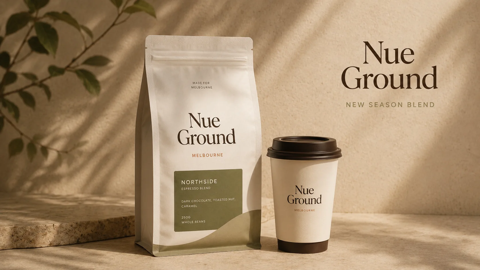
A wordmark system built for everyday cafe surfaces.
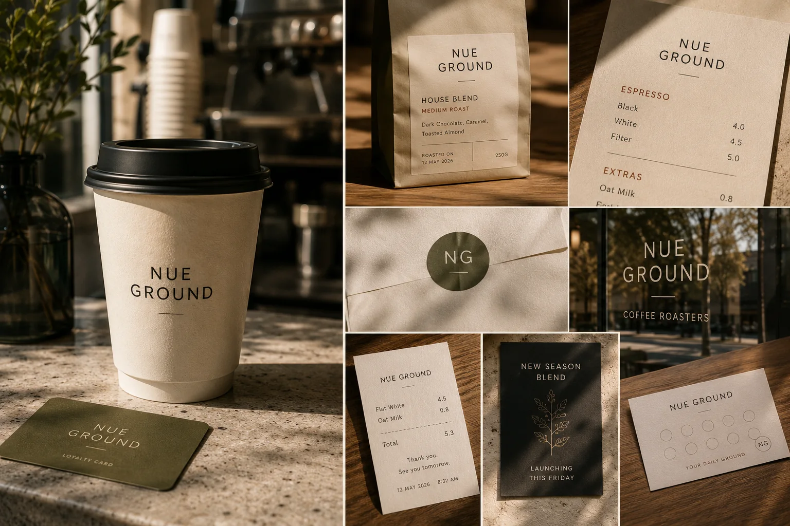
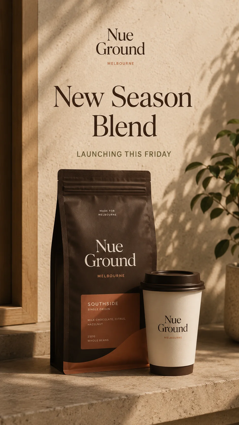
The identity is designed to work across the surfaces customers actually meet: takeaway cups, coffee bags, menu headers, receipts, stickers, loyalty cards and window signage.
Used on cups, bags, menus and window moments.
Reserved for stickers, seals and compact loyalty surfaces.
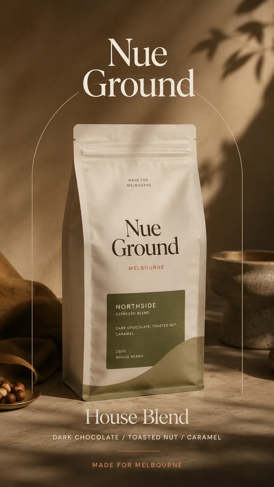
Ground cream, roasted brown, moss olive and warm clay.
Quiet uppercase labels with calm serif-led brand moments.
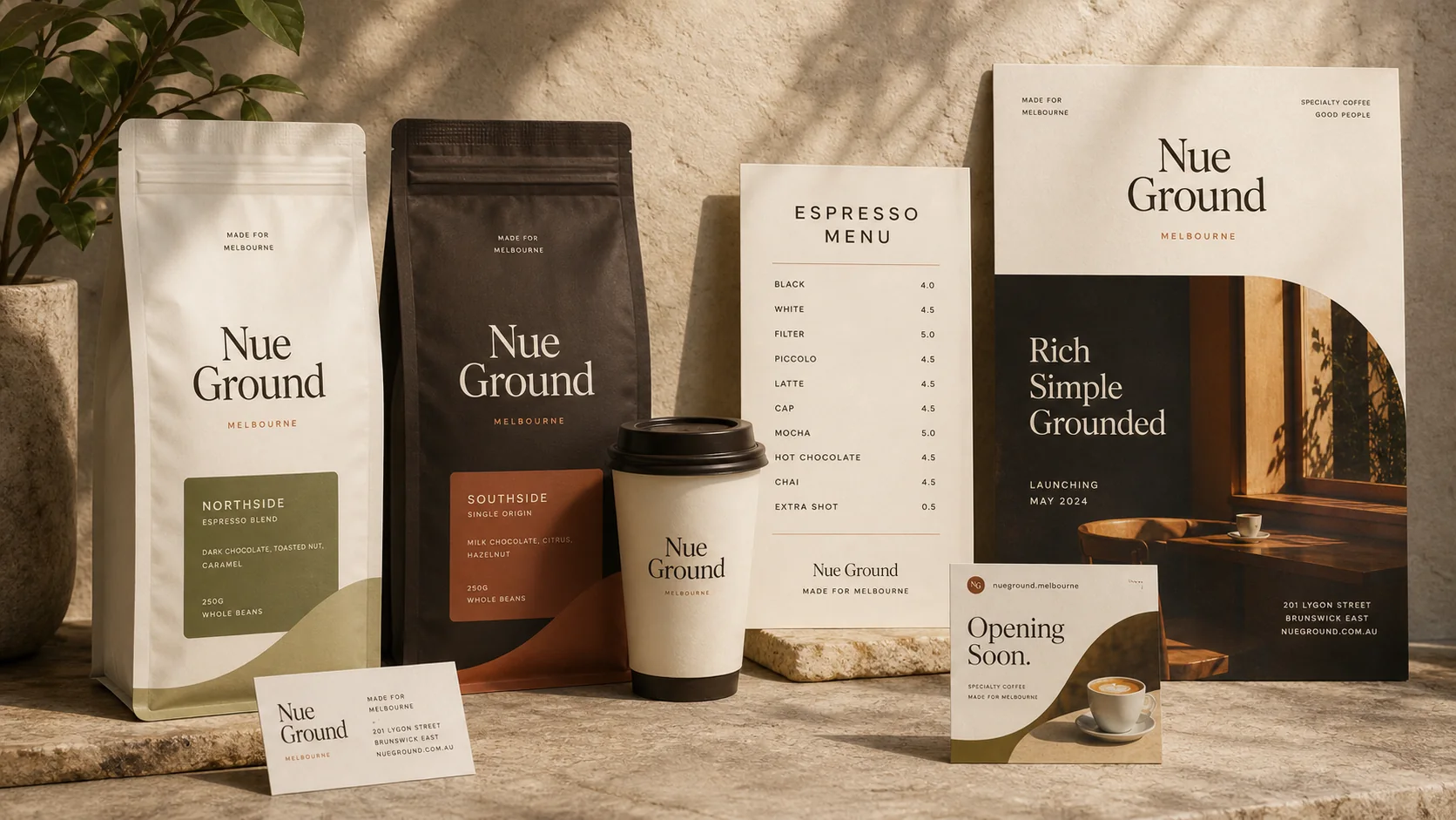
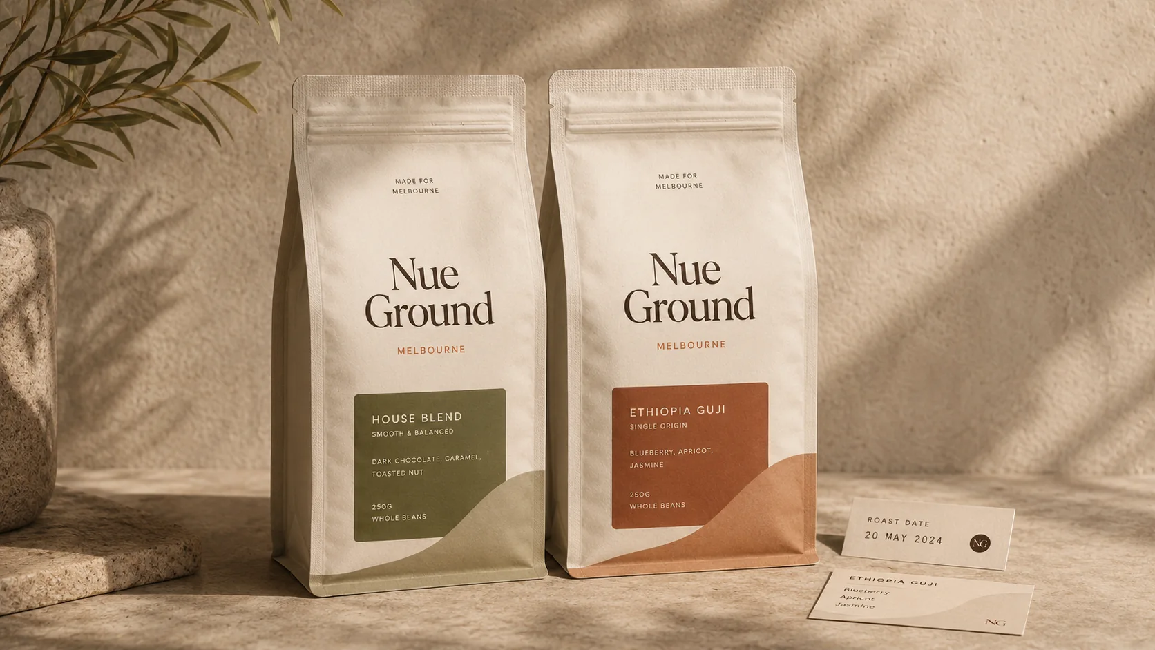
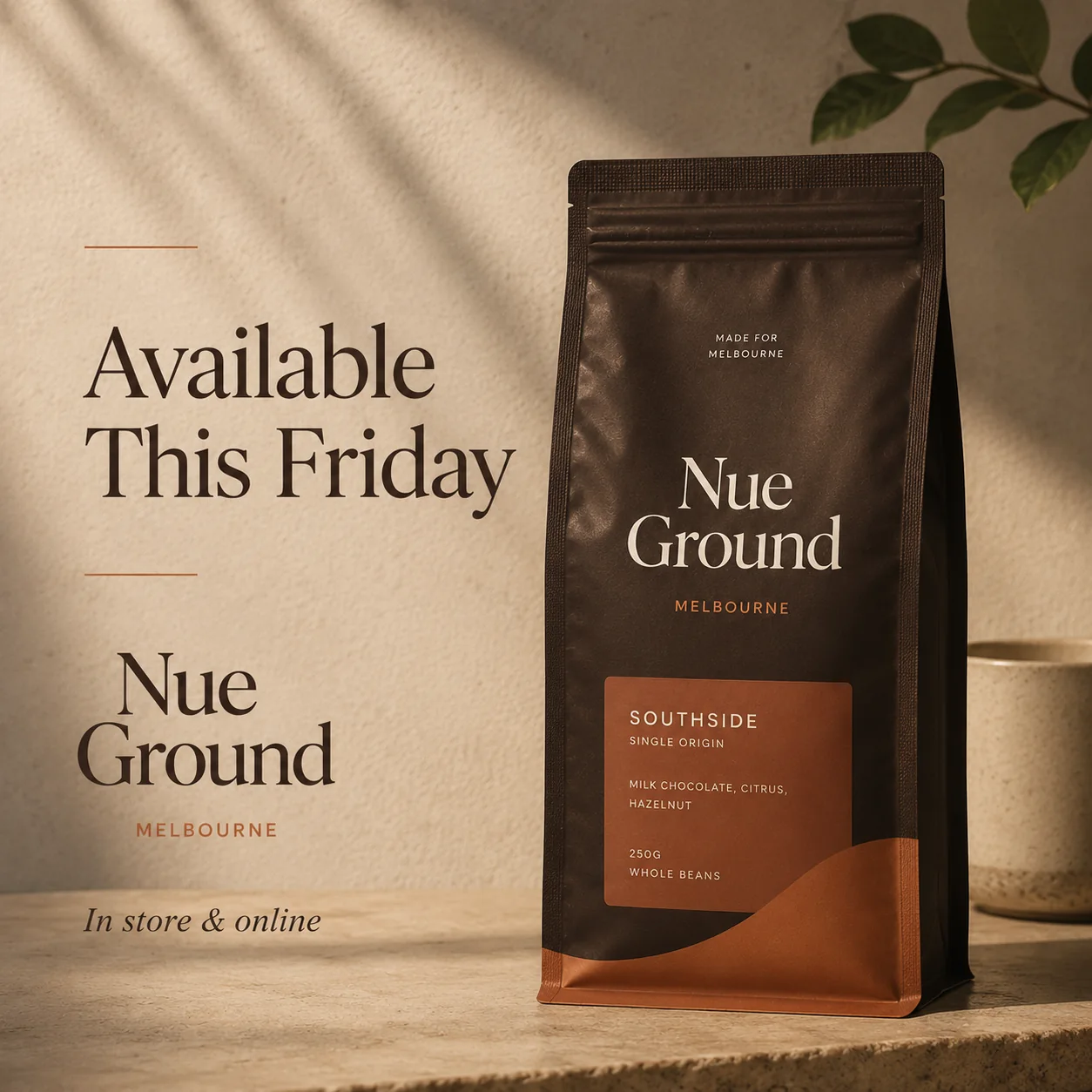
03 Packaging Logic
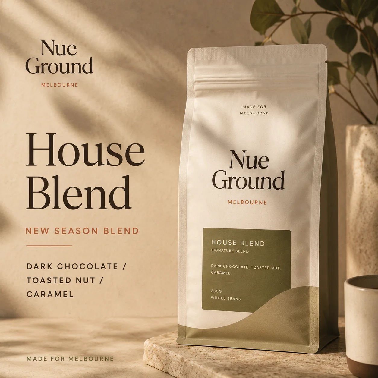
Two blends need one recognisable family system.
House Blend and Single Origin feel related while flavour notes, weight, roast information and product type remain easy to scan.
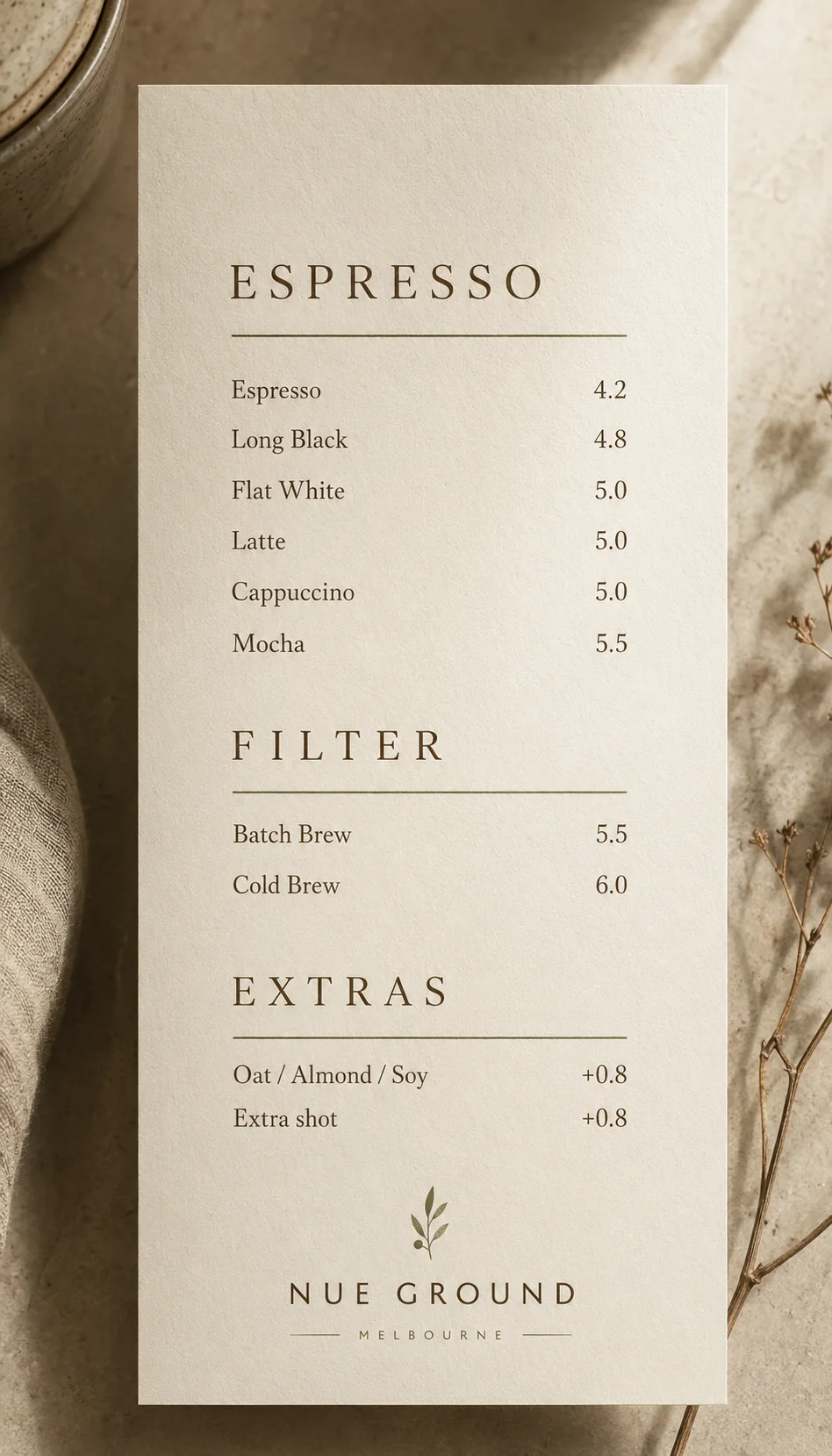
04 Counter Menu
A printed menu with calm hierarchy.
The menu proves the identity can handle practical information. Espresso, filter and extras are separated with clear spacing, long-form price alignment and a quiet brand lockup.
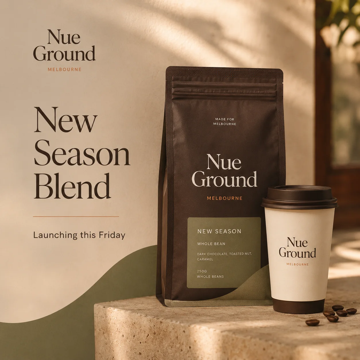
05 Launch Campaign
Launch content across poster, tile and story.
The launch campaign uses a small repeatable message set: new season blend, opening soon, available Friday and morning filter.
06 Social Launch System
A compact launch set built for feed recognition and story momentum.
The system is edited down to one hero feed tile, two supporting square posts and three vertical story frames.
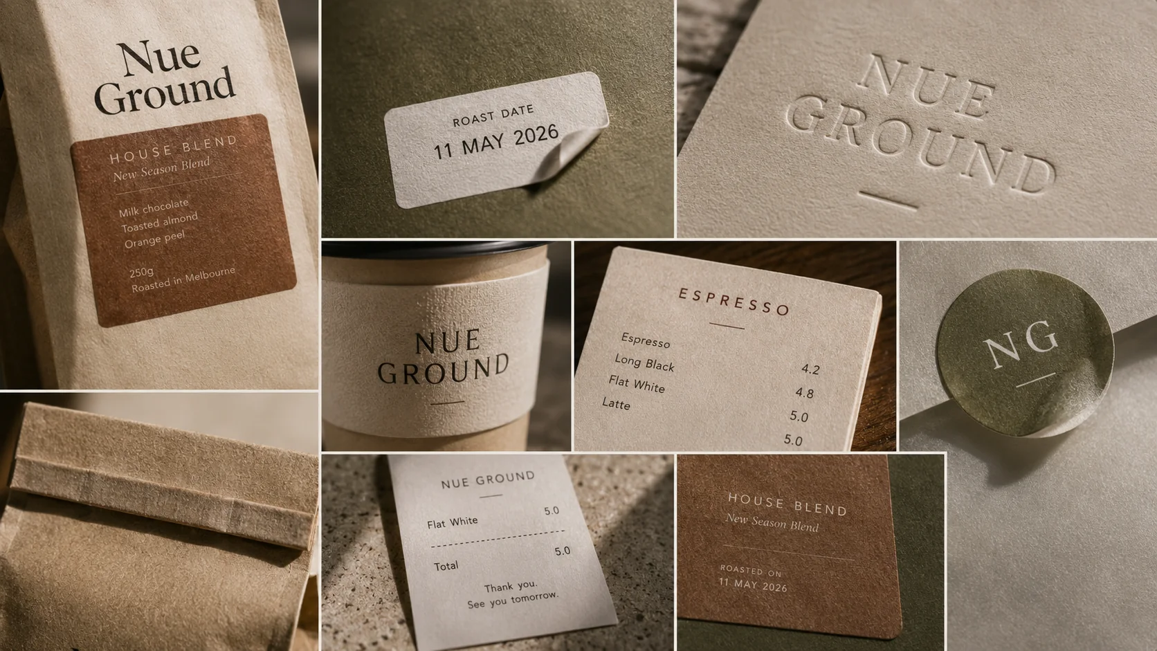
07 Print & Production Details
Small production details make the system believable.
Paper grain, label edges, roast date stickers, embossing, cup sleeve texture, menu ink and small-format print details make the identity feel produced rather than mocked up.
Reflection
What this project proves.
The project is not a single image. It defines identity rules that can move across packaging, menus and retail touchpoints.
The case demonstrates how one positioning idea turns into usable customer-facing materials.
The next upgrade is turning the social frames into a short launch reel and replacing the remaining identity boards with manual vector files.
Start a similar brand system
A cafe brand needs more than one good logo image.
Use this route when the identity needs to work across cups, menus, packaging, store communication and launch content.